
Gardener’s Supply Brand Elevation
When the opportunity arose, I took the reins on modernizing the design and branding for Gardener's Supply. The gardening lifestyle has so many benefits--I wanted to clearly show those benefits in our marketing and inspire other people to garden.
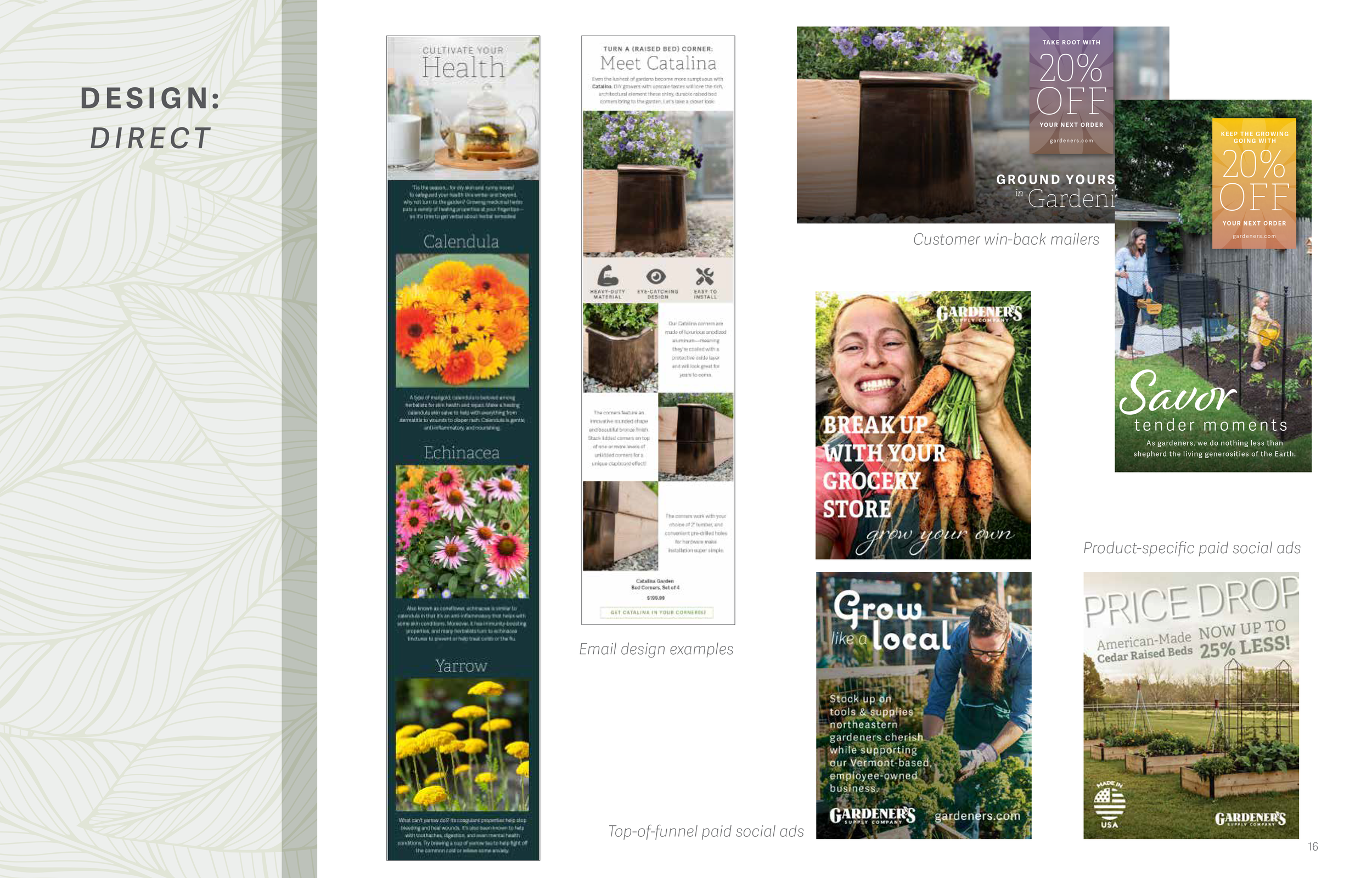
For years, the company's design had been very product-focused. I looked to switch that up and make our creative more inspiring and aspirational, and then nod to our products that could help you achieve that lifestyle.
Working with our Art Direction Lead, our Copywriter, our Interactive Designer, and our Marketing Team, we developed some of the most beautiful, thought-out and inspiring creative the company has even produced. A refined color palette, an elevated brand voice, streamlined typography, and gorgeous macro photography are signatures of this look. We noted increased click-to-opens in our emails, equal catalog performance despite cutting circulation by more than half, and better engagement on our website.
Style Guide | Catalog | Collateral | Social | Retail | Home Page | Email
Style Guide


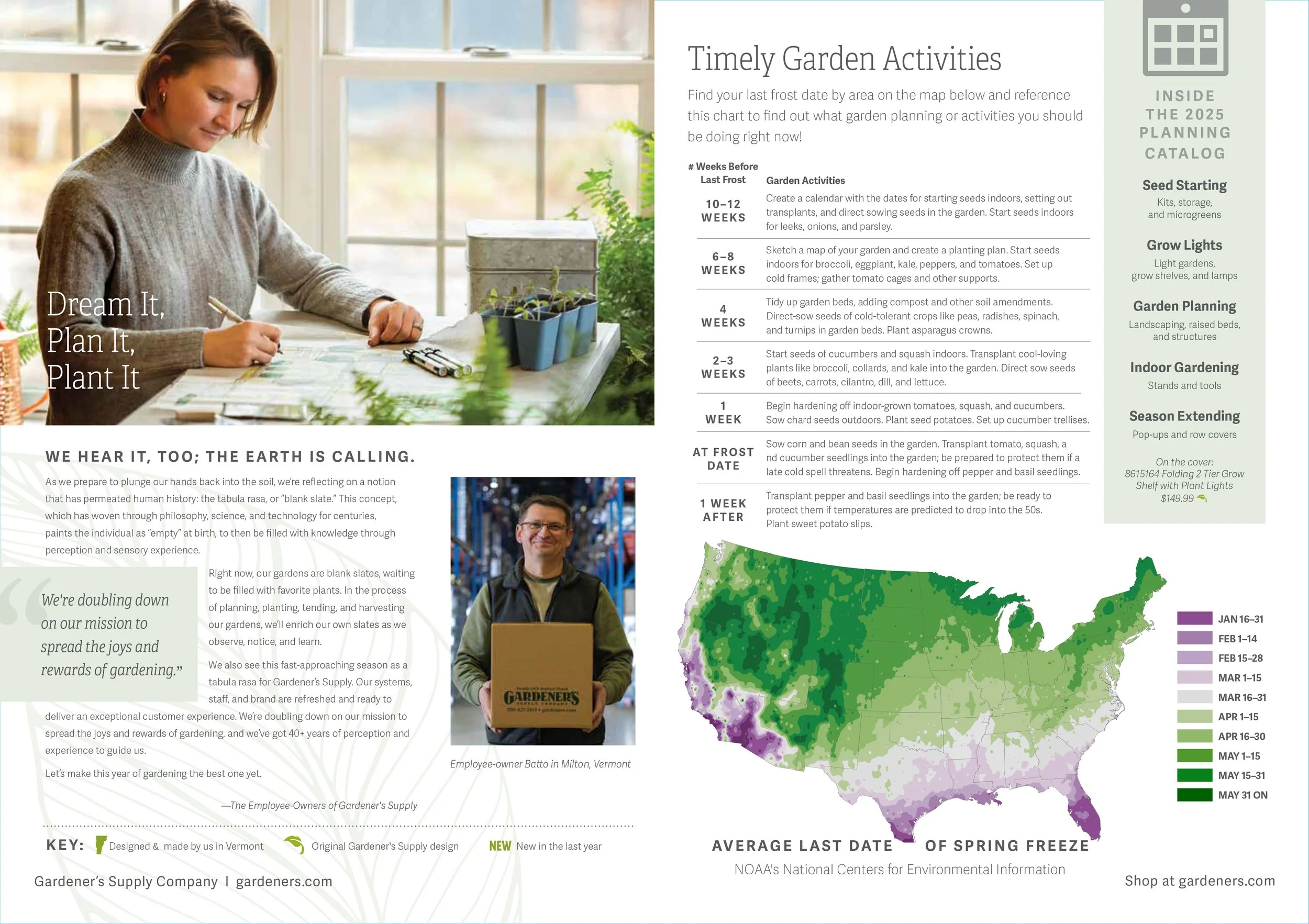
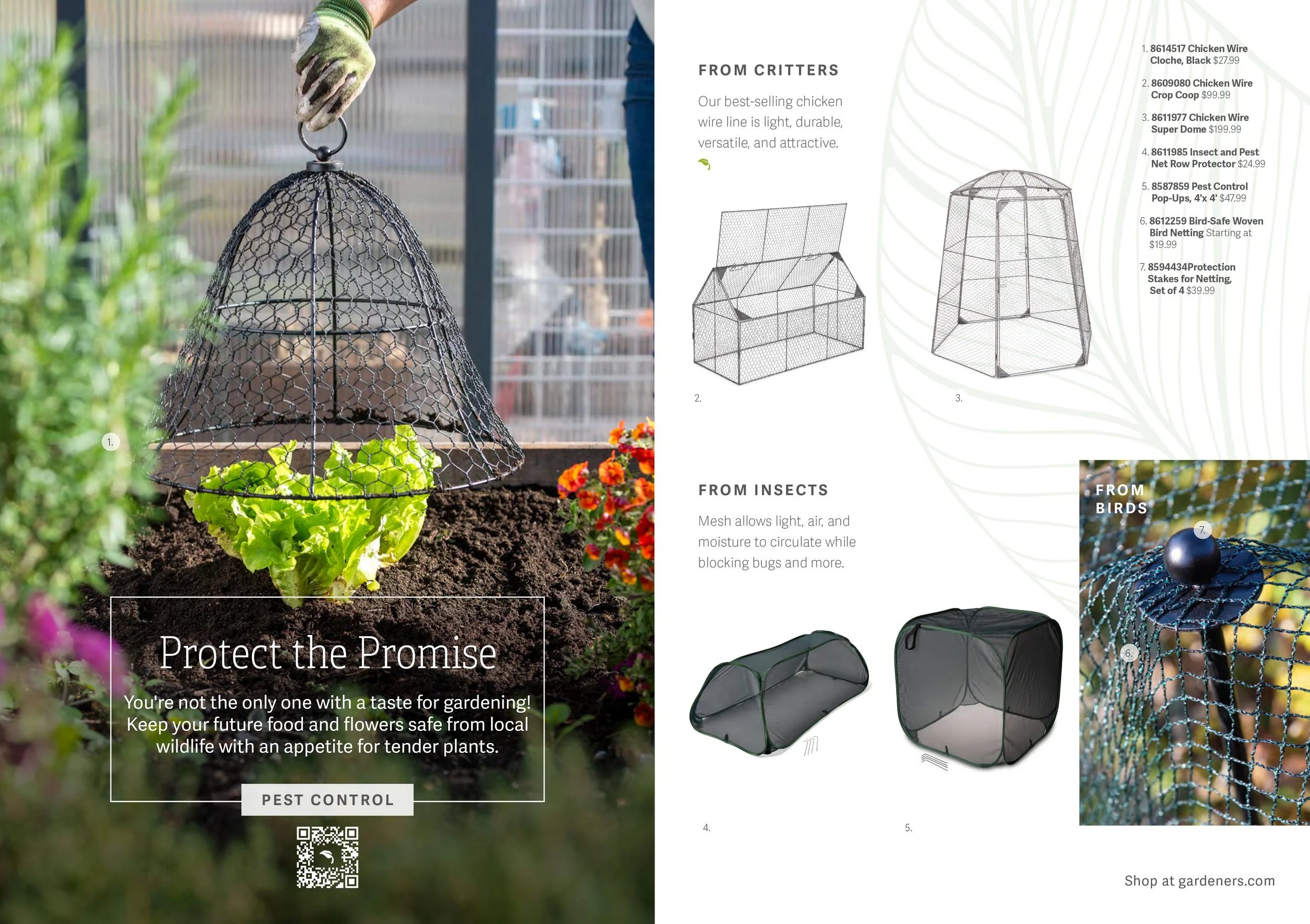
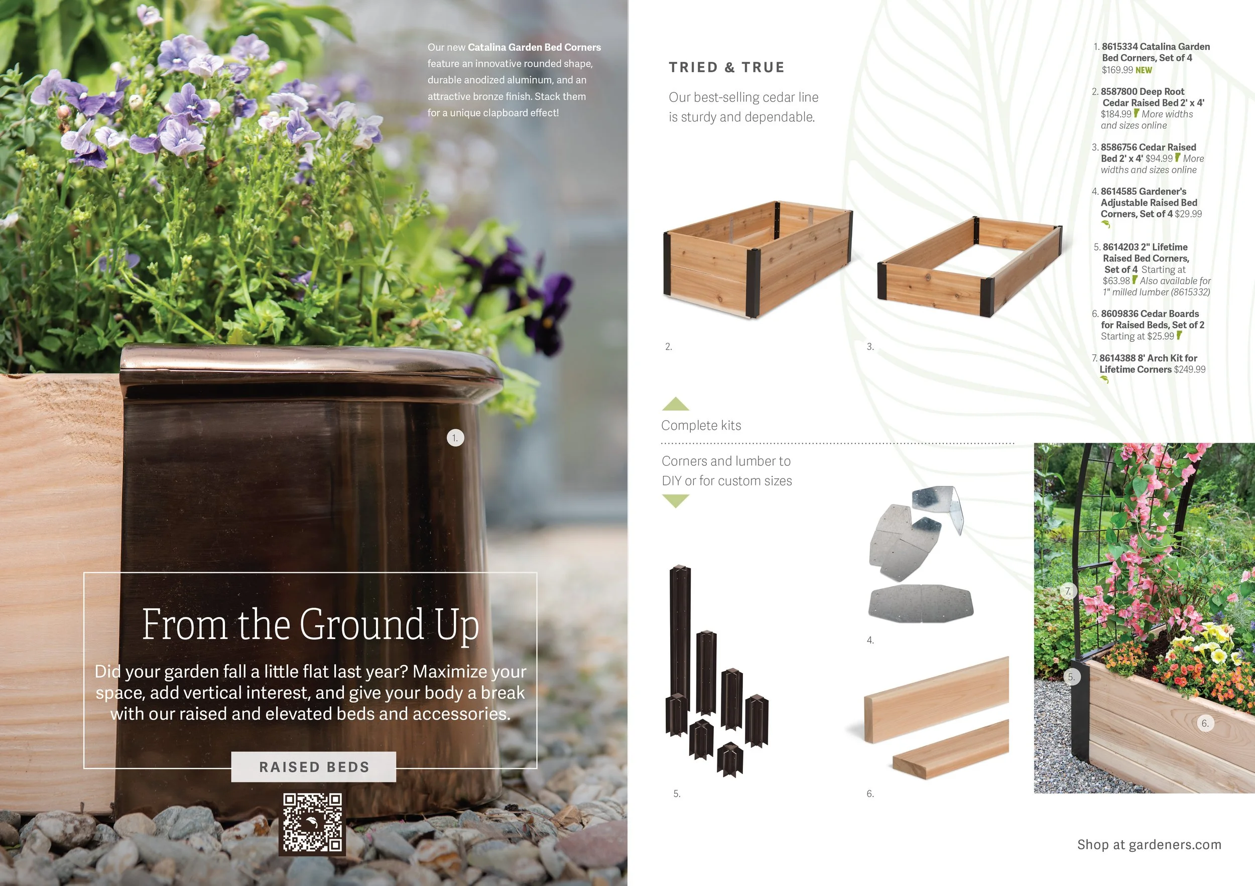
Catalog
Navigate through the below spreads with side arrows
For a more comprehensive overview on this catalog redesign, please see the project at my older site, here.

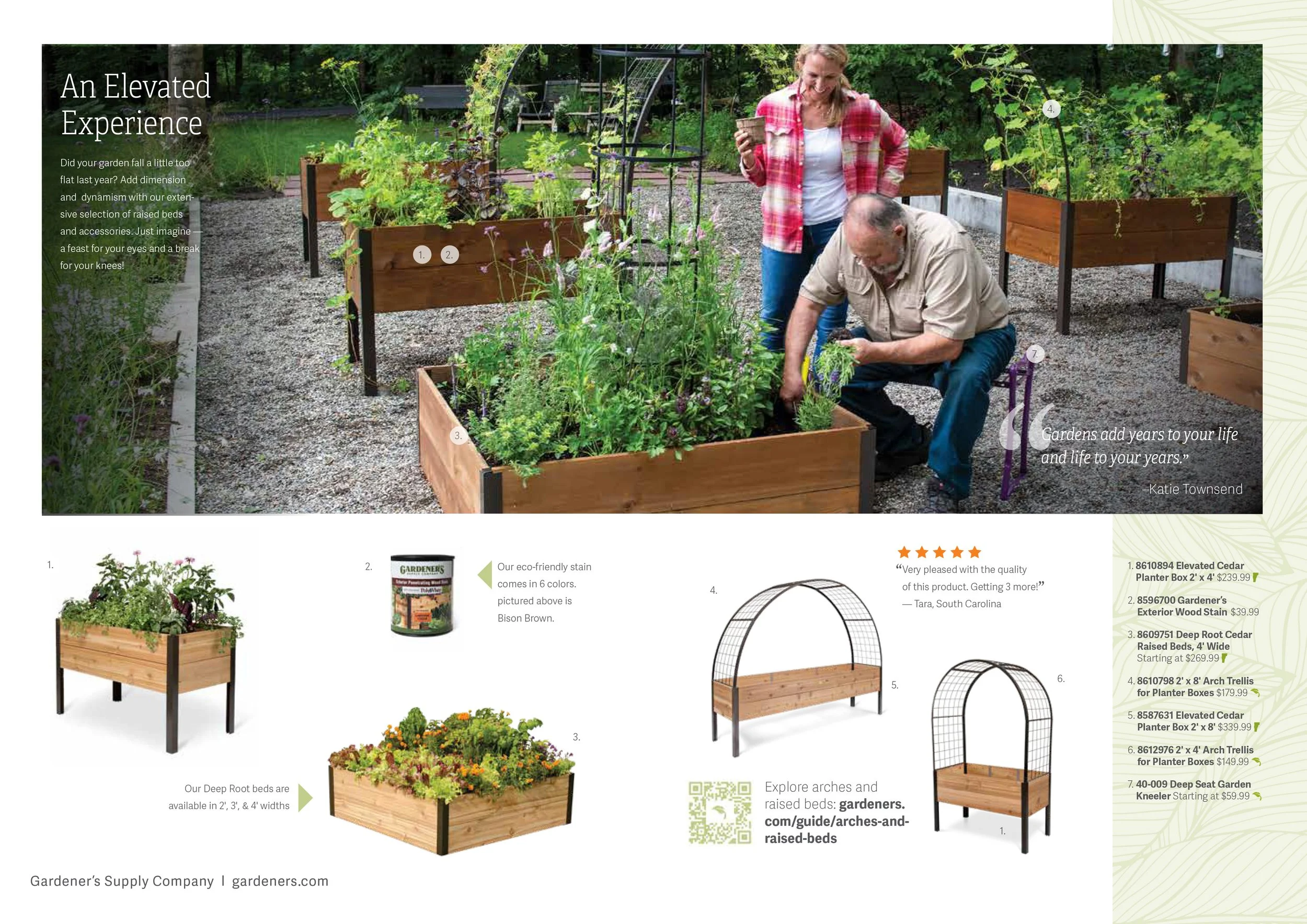
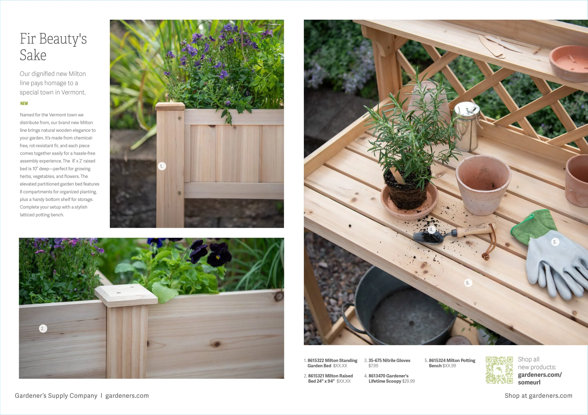
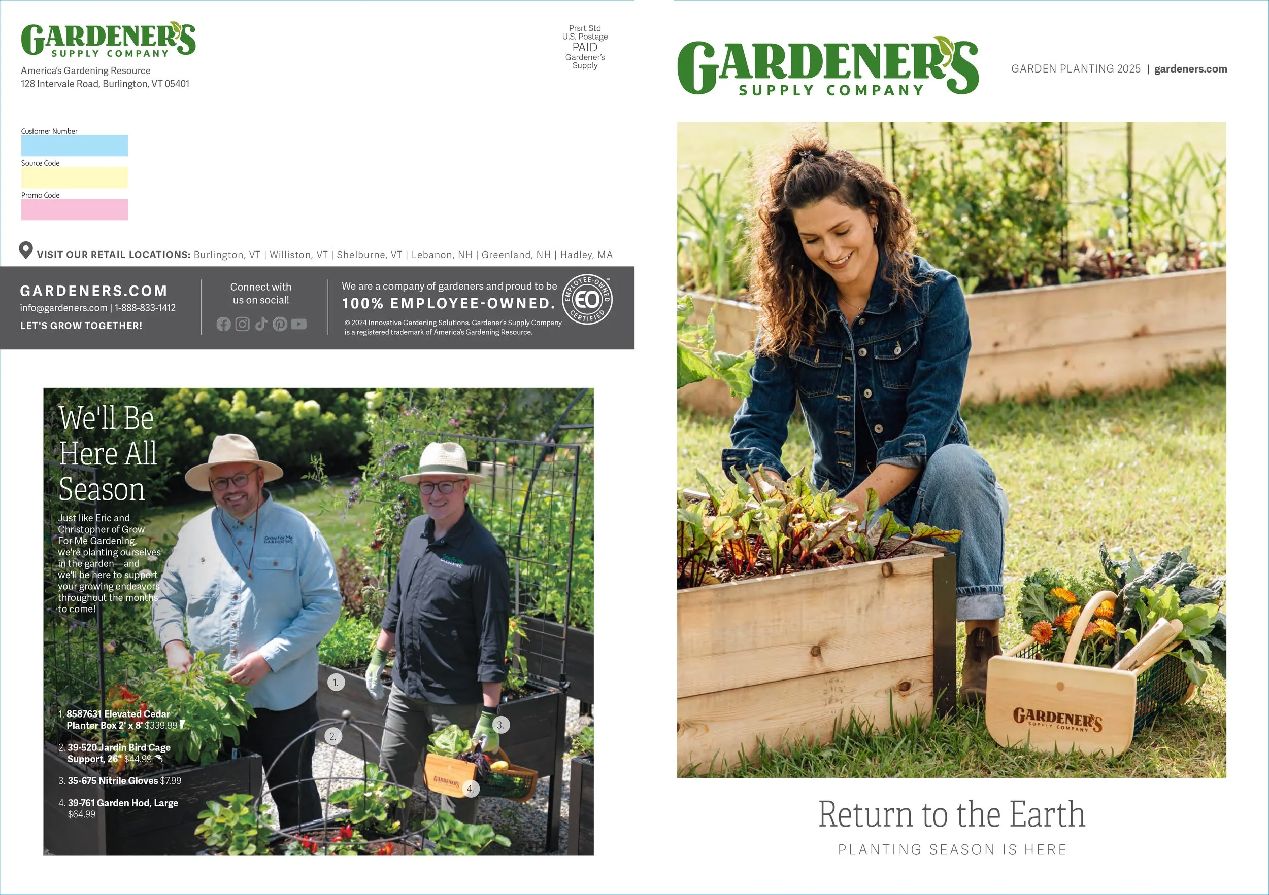
Templated, updated catalogs based on seasonal campaigns. Click arrows to cycle through spreads.

Print Collateral
Hello Fresh Box Promotional Insert


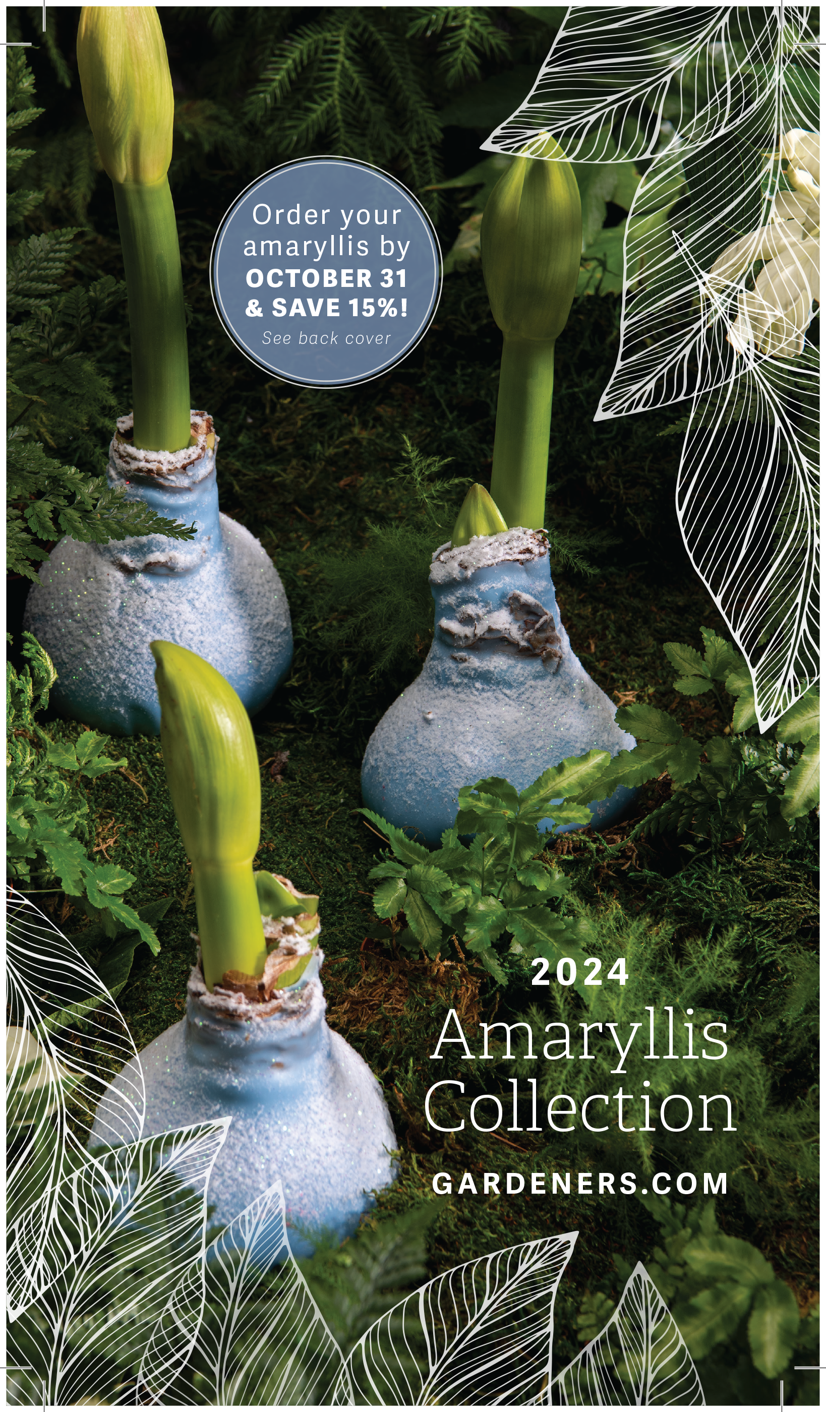
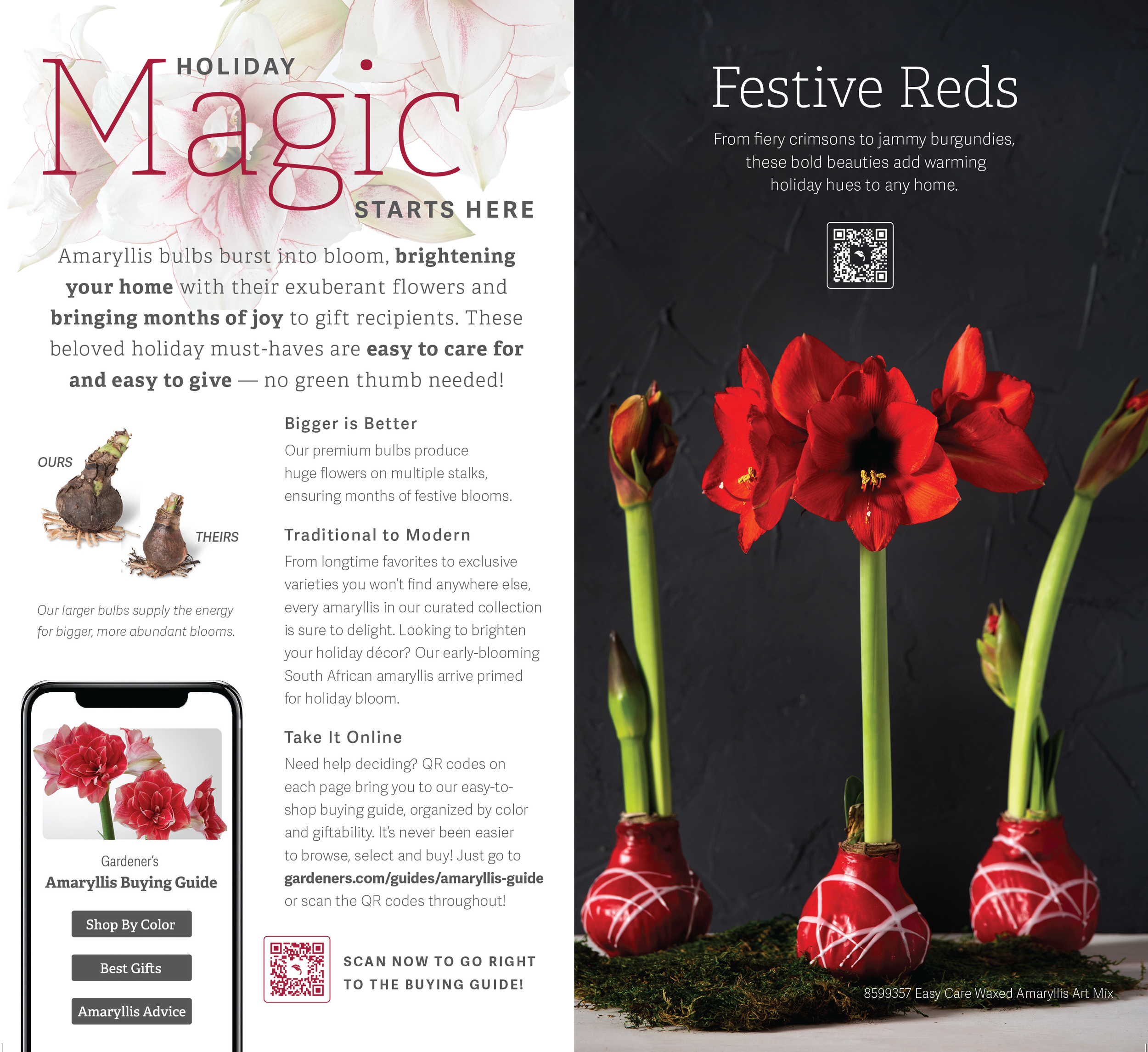
Amaryllis Collection Direct Mailer

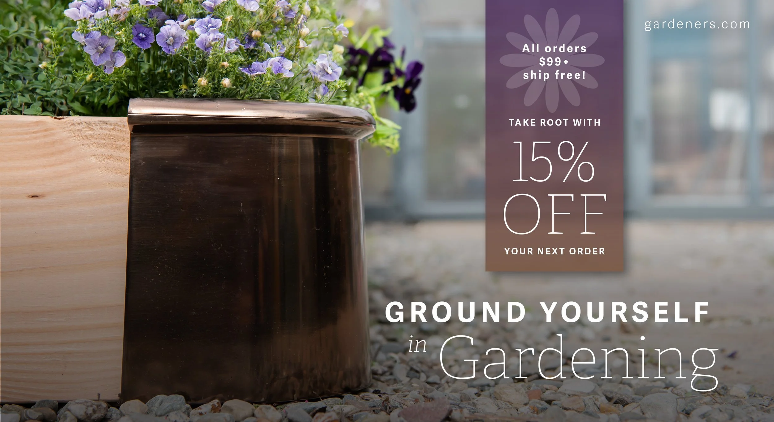
Customer Reactivation Mailer


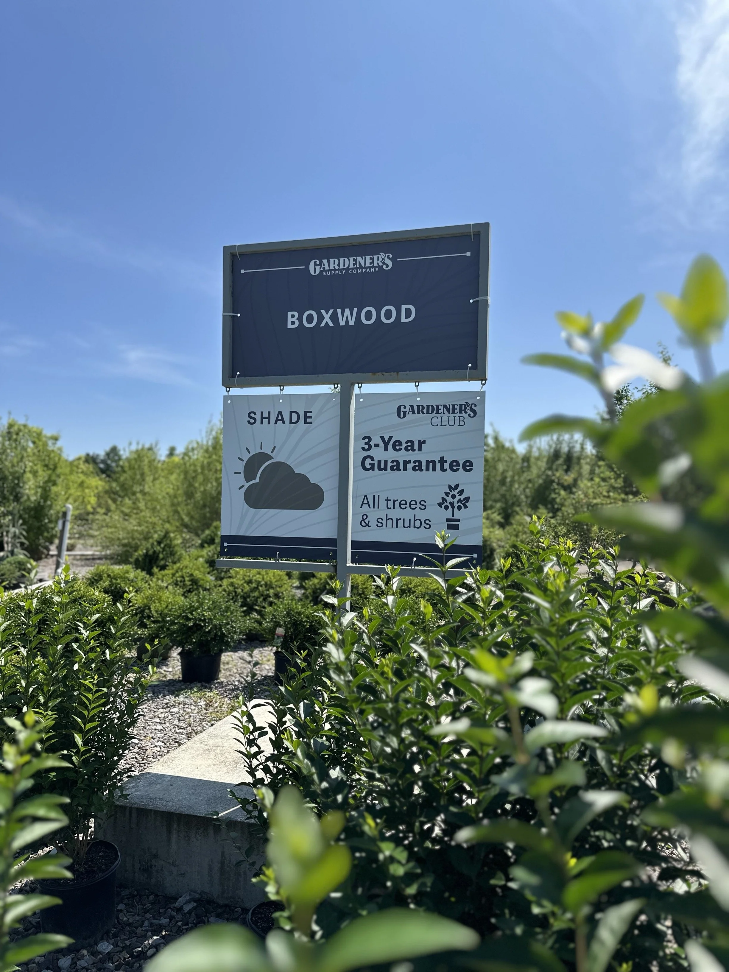
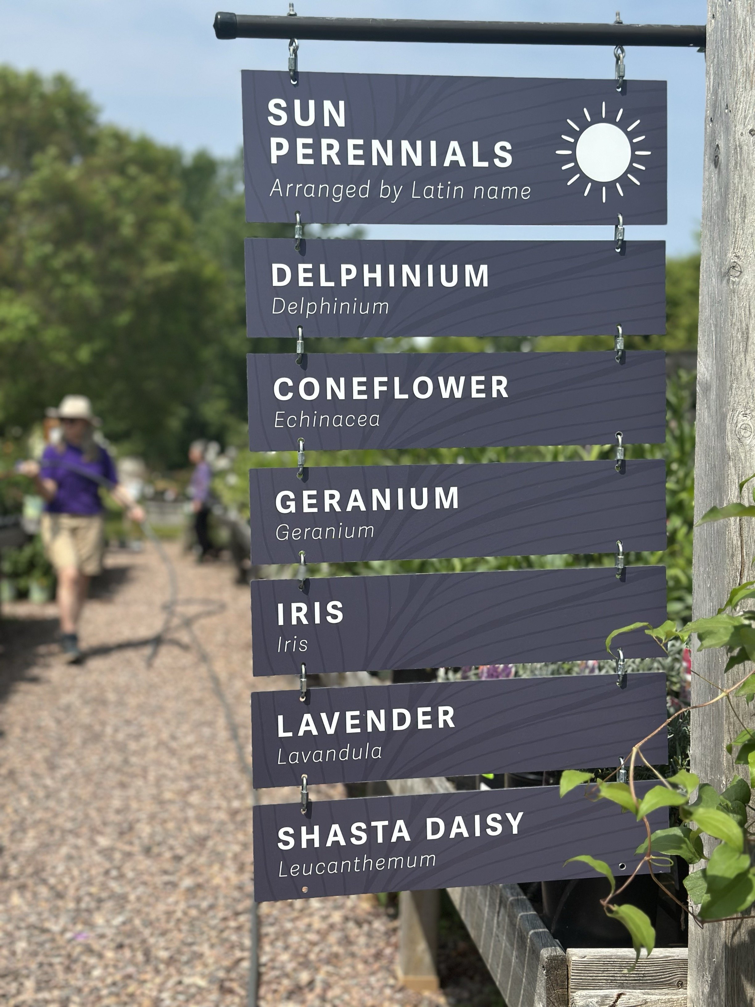
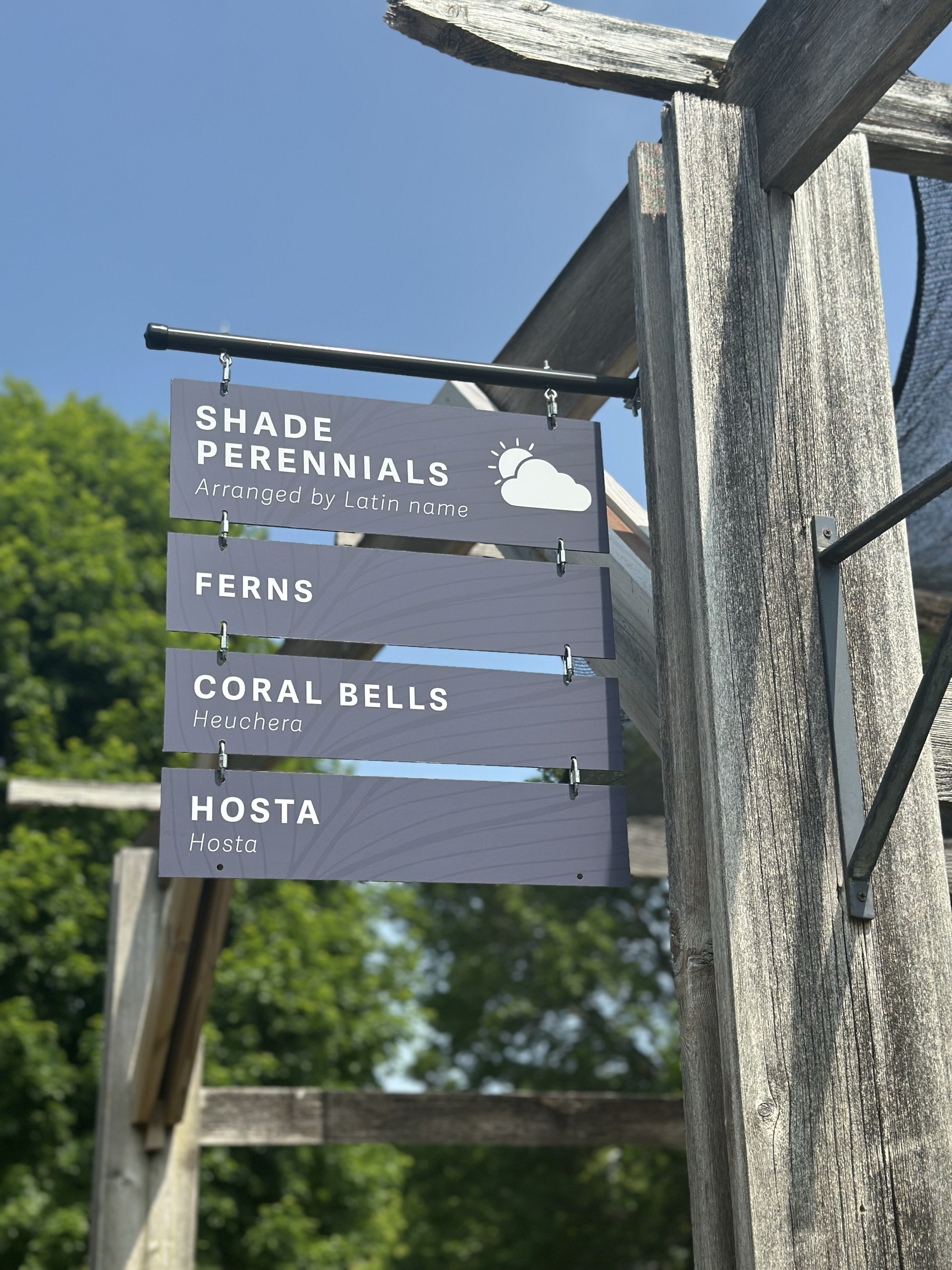
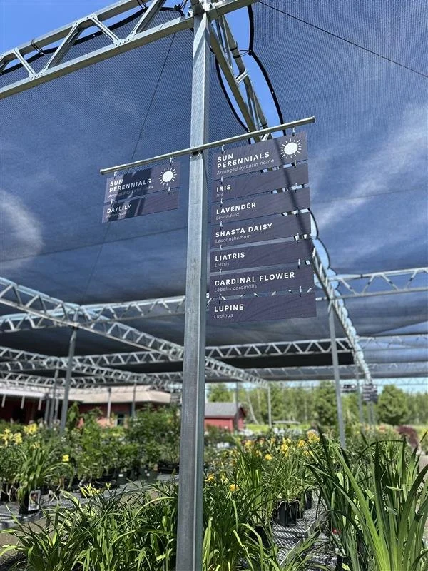
Retail Nursery Signage


Home Page
See it live.


Social “Top of Funnel” Assets